452/523 Collection

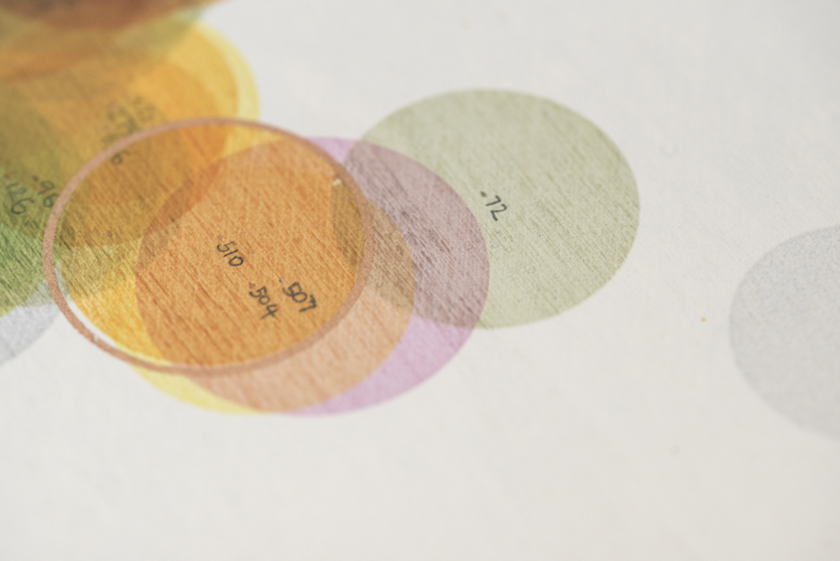
‘452/523 Collection’ is a new artwork developed especially for ‘Voices from the Roof of the World: Trees, Seeds, and Mountains’, an exhibition exploring the impact of climate change and the work of Aga Khan Agency for Habitat, Kew Garden Global Tree Seed Programme and One Resilient Earth.

A description of how the art work was created can be found below the images. 

All images by Jo Hounsome photography.
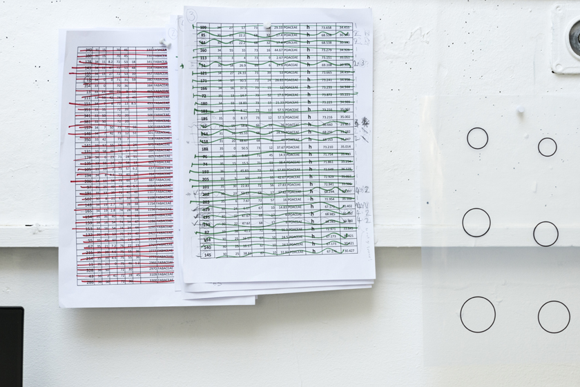
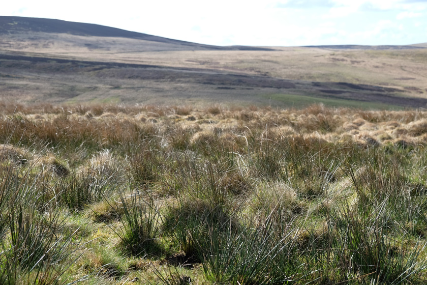
I was commissioned to create an artwork which would celebrate the abundant and diverse plant life found in Pakistan.  As part of my initial research, the partners at the Kew Global Seed Bank sent me a spreadsheet containing the details of 514 of the plant species found in Pakistan which have already had their seeds collected and stored in their  vault. This spreadsheet became the basis for my work.

Kew’s partners in Pakistan provided me with an additional list of 22 plants which they consider to be important species.  Some are rare, some medicinally beneficial, some economically relevant, and most are under threat for at least one reason.  13 of these plants were already in the Kew database, but nine had to be added.  Of the original 514 plants, 62 of these could not be plotted due to lack of  location data.  I was left with a total of 452 dots to plot and print.

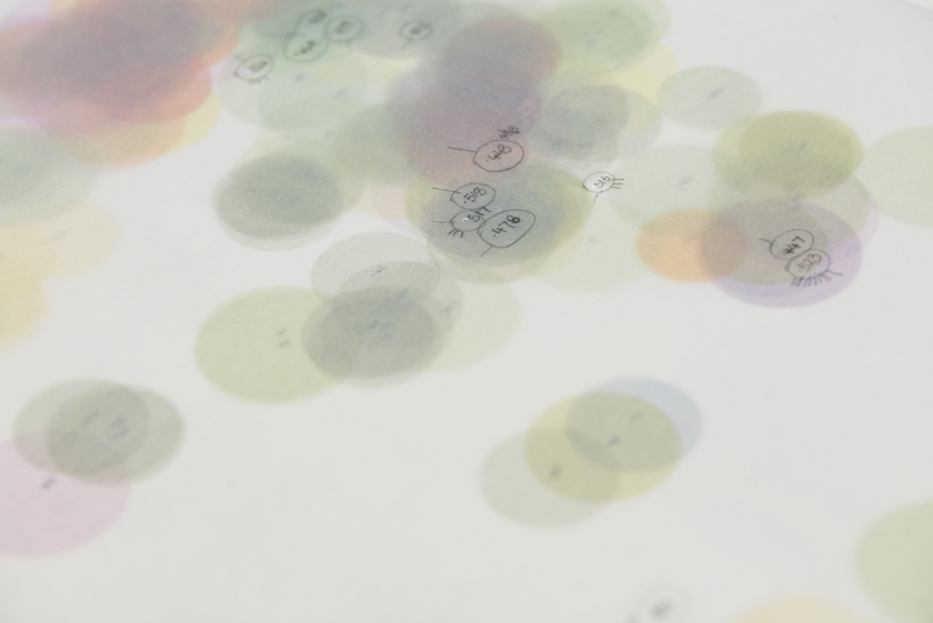
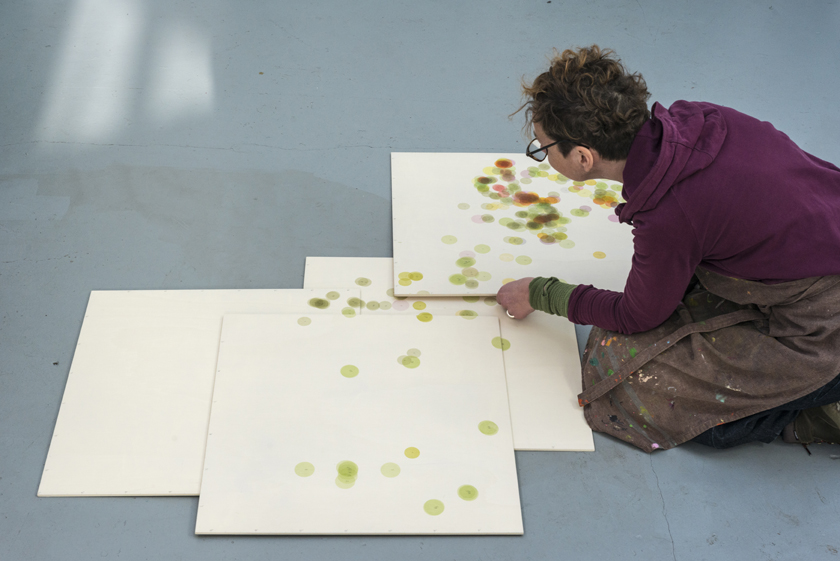
The  artwork comprises  four plywood boards, designed to be hung in such a way that the outline of Pakistan could, theoretically, be transposed onto the printed surfaces to create a map.

From the information recorded in the spreadsheets, I decided to focus on different family groups, and geographical location (Latitude and longitude) for each collected plant.  Further research was needed to divide the data into groups of Trees, shrubs, herbaceous and non- herbaceous plants.

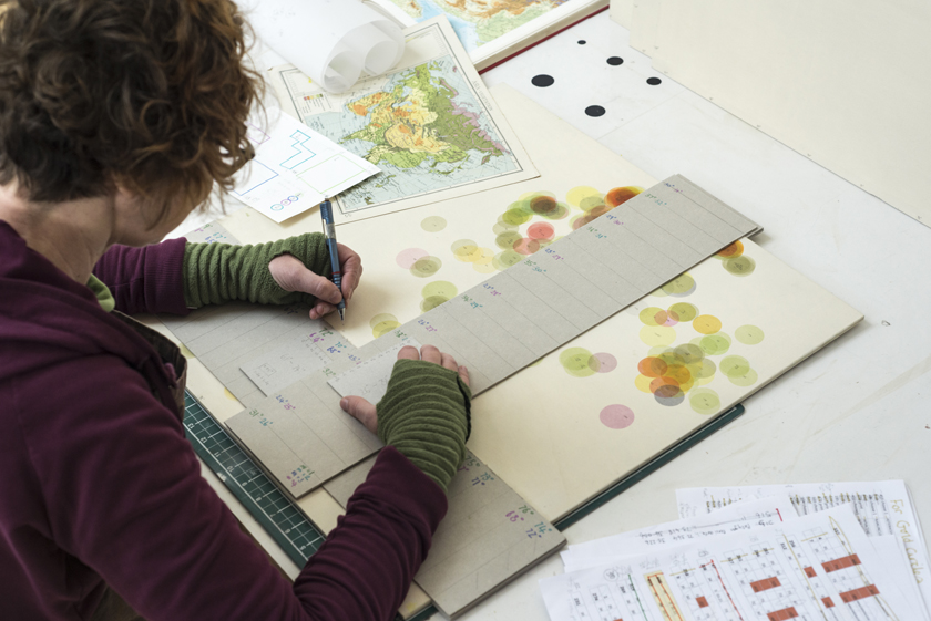
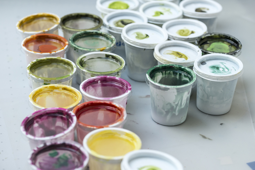
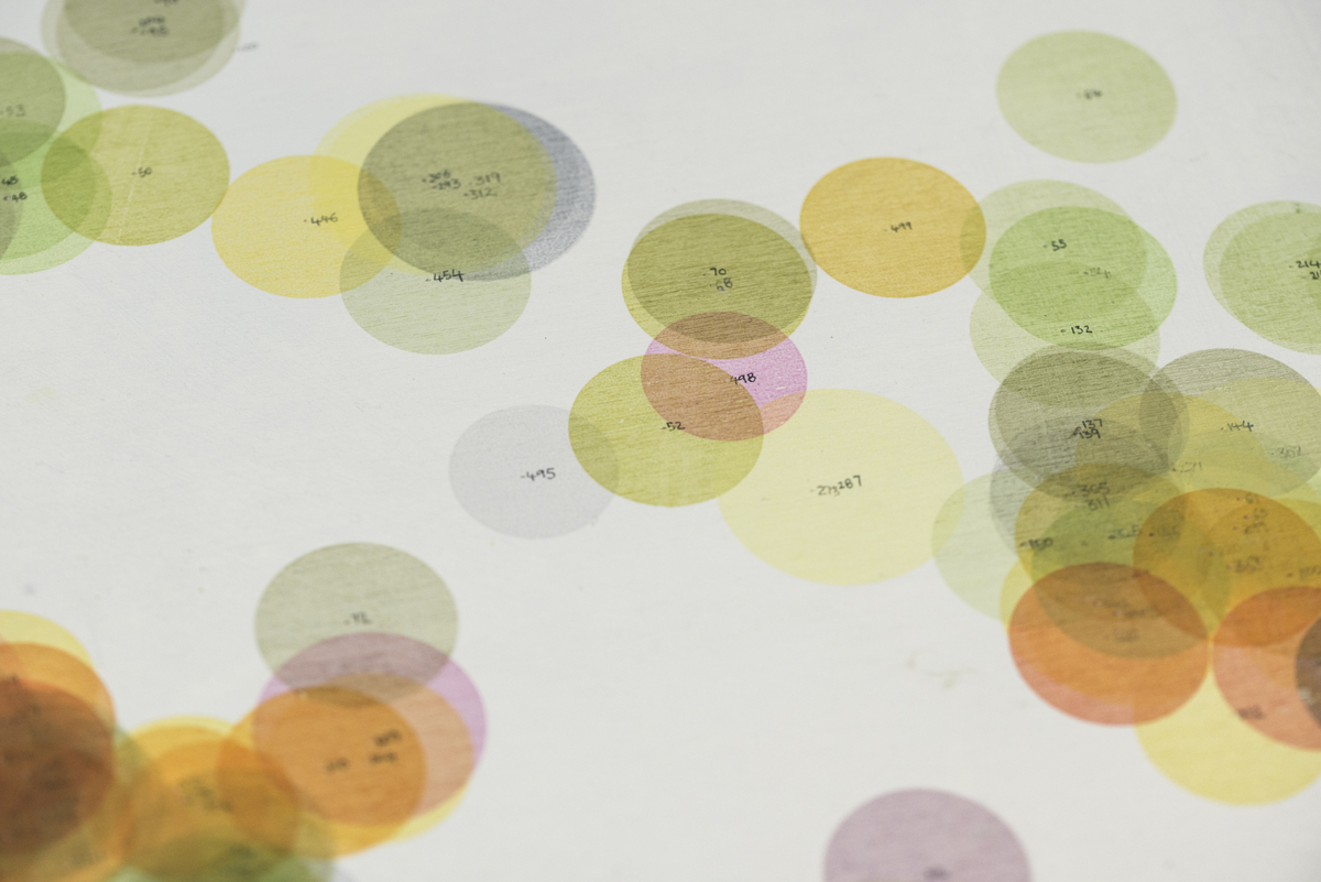
Few things make me happier than using found palettes in my work – in this case my colour scheme comes from a 1940’s Encyclopaedia page illustrating the general distribution of vegetation in Asia.  I have given each plant family a different colour, broadly corresponding to the colour key from the vegetation map. I arranged the families in order of prevalence, from  Poacea, with 129 dots, to Malvaceae with just one.  The largest dots represent trees, the next size shrubs, then herbaceous plants and the smallest dots are non-herbaceous.

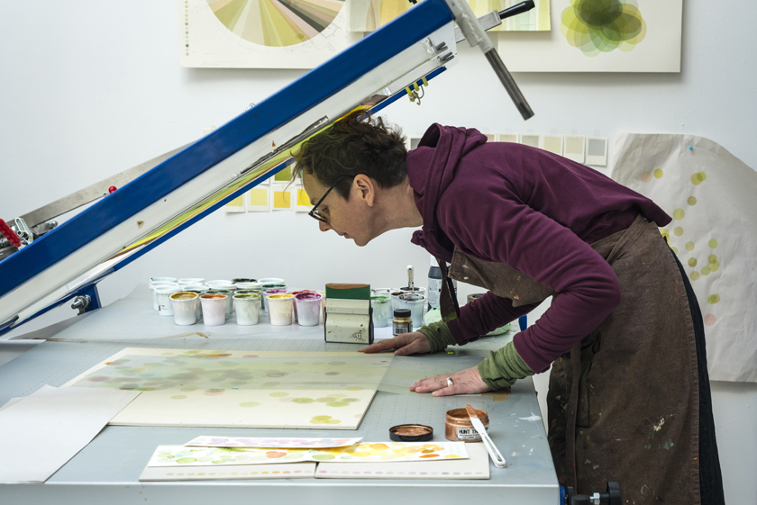
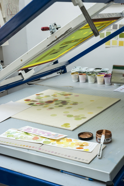
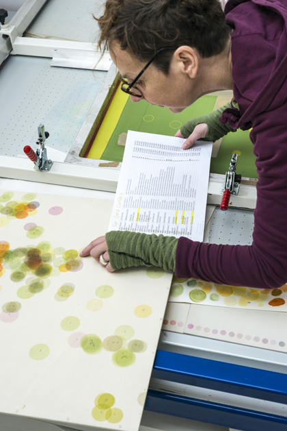
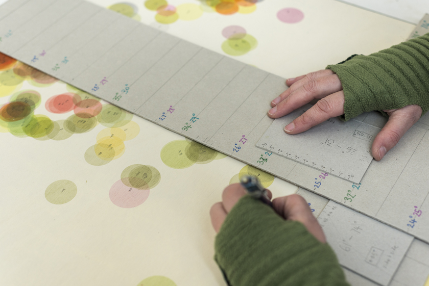
 As I have Aphantasia (a ‘lack of a mind’s eye’), I frequently have no idea what a piece is going to look like when I start making it.  This has never been more apparent than with this piece of work.  As I was responding to the data, I didn’t know how the dots would be distributed until I plotted and printed each one. Each dot was painstakingly plotted to the correct latitude and longitude using carefully marked cardboard rulers, and then printed in the appropriate size and colour.  

I lost count after 40 hours of printing. I am sure there are quicker and easier ways I could have worked, but none would have been so satisfying.   I felt I was building a collection, taking care over each individual dot, giving it the attention it deserved.  

It quickly became apparent that some areas of the ‘map’ would be densely layered with dots, whilst other areas are almost bare.  The colours changed and morphed as I added  the different families – the greens of Poaceae and Fabaceae  being overlaid with the yellows of Ranunculaceae and purples of Pinaceae,  creating dense patches where it was hard to distinguish the individual dots.

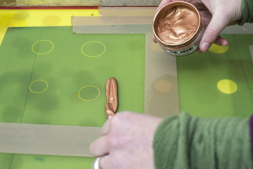
I finally added a golden halo to highlight each of the 22 important species, and now all that remains is to see if my complicated hanging method works!

Pressing Matters

A really lovely article about my landscape circles in edition 20 of Pressing Matters.

VARC Residency

In May this year I had the most amazing time at Highgreen Manor in Northumberland. My first residency was a total joy. It was hosted by VARC as part of their ENTWINED programme, and I was lucky enough to be co-hosted by Unison Colour Pastels. Somehow, since I got back, time has flown, and the blog posts which I fully intended to write about everything I saw, the people I met, and the work I have produced, have so far failed to materialise! I am now back off up to Northumberland to set up my part of the ENTWINED exhibition. When I get back, the blog posts will be written, and there will be a myriad of photos for you to look at…

Latitude and Longitude

I realise that the titles of my recent prints are a bit of a mouthful, but I am quite excited about ‘51°51’42.2”N 3°03’21.5”W’.  It is the first one of my ‘colour of place’ series to be based on somewhere in the Northern Hemisphere.  The previous seven have all been inspired by places in Australia and so had ‘S’ and ‘E’ (South and East) in their titles.  This one is inspired by the view from Sugarloaf Mountain in Monmouthshire, Wales, so is North and West.

The titles give the latitude and longitude in degrees, minutes and seconds (this is where Google Maps comes in very handy to pinpoint exact locations).    Latitude tells you how far North or South a place is, from 90° North at the North Pole, through 0° at the Equator, to 90° South at the South Pole.

Longitude lines run from Pole to Pole and tell you how far East or West you are of the Prime / Greenwich Meridian in London.  Anything east of the Greenwich Meridian is in the Eastern Hemisphere and is labelled °E.   Anything west of the Greenwich Meridian is labelled °W.

I always feel it is more like drawing than writing when I name my prints.  I like the idea that the titles I give my work can mean everything or nothing – you can use them to pinpoint the exact position where the photo that inspired the print was taken, or just accept them as additional information like that found on the key to a map.

Planning A Geological Print

I’ve recently shown my series of Geological prints on Instagram after not really looking at them for a while. I thought you might like to know a bit more about them…

The prints came about after an odd series of conversations that ended up with my becoming the custodian of a very large collection of maps that, without my intervention, would have ended up in a skip. Endless out of date OS maps, fascinating large scale maps of the Bristol area, the odd map showing land use in Africa, and quite a few of the most wonderful, subtly coloured geological maps.  It took me about a year of thinking before I came up with a way to use these geological maps as inspiration for my prints – when something is so beautiful in its own right, it becomes somewhat intimidating. 

These circles are simplifications of the maps and the colours found upon them.  I abstracted the main areas of colour from within a chosen circle (each colour on a geological map represents a type, or age, of rock), and printed that shape in the appropriate colour.  As the shapes on the map are so amorphous, when you turn them into geometric shapes, you create many areas of overlap.  As the inks I use are so translucent, this meant where the colours were printed over each other, new colours were formed, and the resulting image diverged from the colour scheme of the original map.

When I was planning each print, the process seemed very logical and precise to me.  But now, looking back at my sketchbooks, I find it hard to follow my own logic – I realise that I must do more planning in my head than I thought!  Still, even if they don’t make total sense, here are some of my sketchbook pages.  They show planning and preparation for my South London, Bath, Bristol, Lizzard and Brighton prints.

If you would like to see the finished prints, please visit my Geological Prints page.

Sketchboook page of circular composition ideas for geological prints
Sketchbook page of compostion experiments
sketchbookpage of colour experiments
Sketchbook page of colour matching and composition for Brighton printprint
Sketchboook page of circular composition ideas for geological prints
Sketchbook page of colour matching and composition for Bristol print
sketchbook page of colour tests for print
Sketchbook page of colour mixing experiments

Bristol – Colour of Place

42 sand and crushed rock samples displayed in a stand made from reclaimed wood. All the samples were collected during August this year, many of them from the building site at Temple Gate.

This piece is going to be on display in Centrespace Gallery from 12-16 October as part of the Centrespace Open Studios. Please come along and say ‘hello’, I will be in studio 27 on Friday evening and all day Saturday.

Eastbourne – Colour of Place

Subtle colours collected on my walk from Eastbourne Pier to Holywell.

The bottom of this flask is filled with chalk that was collected as either small rounded chalk pebbles, or chunks of chalk that had broken off much larger boulders. I crushed the pieces in a pestle and mortar to make the powdered chalk. Some pieces crumbled almost instantly, others put up an almighty fight.

From left to right – Eastbourne sand from the middle of the beach, and then near the shore line, different coloured chalks from the cliffs, and shell sand from just past Holywell.

Eastbourne

I was in Eastbourne last weekend for the Ink Paper + Print Fair at the Towner Gallery. It was so funny, I have an almost non-existent visual memory, but as soon as I sat on the pebbles of Eastbourne, it was like saying hello to old friends. Many moon ago I did my degree at Brighton and spent an inordinate amount of time sitting on the beach sorting through the pebbles. And here they were again in all their mixed colours and flinty wonder, so different from the smooth banded grey rocks I have got used to in the West.

Before driving back to Bristol on the Monday morning, I treated myself to a walk west along the beach as far as the cliffs at Holywell. The colours changed as I walked, the oranges disapearing, being replaced by greys, which in their turn were out numbered by white. The pebbles underfoot eventually becoming dinosaur eggs of rounded chalk which hardly made a sound as you walked over them.  The white cliffs were multi-tonal, beautiful to look at. 

Bristol Colour

Test tubes filled with different coloured sands. Bristol

My sand collection, started in Australia last year (Collecting Colour) continues to grow whenever I visit the great outdoors, but I hadn’t really considered the fact that I could add to my collection whilst I was in the city.  I have been reading ‘Origins’ by Lewis Dartnell and the following sentence made me think – ‘the story of civilisation is the story of humanity digging up the fabric of the planet beneath our feet and piling it up to build our cities.   Everyday my walk to my studio takes me through the building works of Temple Gate – a huge road improvement scheme that had meant for the last two years you are never quite sure which way you will end up going to get past Temple Meads and into the city.

As I wander past in my morning or late afternoon daydream, I have seen constantly changing piles of sand, aggregate, concrete etc. as great holes and trenches  have been dug , had mysterious things happen within their depths, and then been filled in again .  But because these sands were building materials, they didn’t fit with my idea of collecting colours specific to place.  Reading the text by Dartnell made me realise that these imported sand would become the colours of Bristol.

Eurovia site, Temple Gate, Bristol

So, on a slightly soggy Tuesday at the end of August, I could be found in the company of Becky, the site Quantity Surveyor, in full fluorescent gear, searching the site for sand.  We found 24 different sands (including a lovely soft grey that Becky went out of her way to track down for me, remembering that it had been one of the first sands to be delivered to site), gravels, and rock fragments that I was able to crush into powder.  I am amazed at the variety, if asked beforehand I think I would have expected to find just one or two different types of sand on building site.

Emily Ketteringham in fluorescent jacket and hard hat
Test tubes filled with different coloured sands. Bristol

As well as adding to my test tube collection, I had enough to make this tower of sand – I feel a trip to Alum bay in the Isle of Wight might be needed…

Measuring tube filled with layers of sand from Temple Gate, Bristol

Thank you very much to all at Eurovia for letting me visit the site.

Collecting Colour in Australia

Over the two months we travelled round Western Australia, I filled 119 tiny test tubes with sand, gravel, ochre, ore, and if I am very lucky, one test tube might even have tiny bits of fossilised stromatolite in it. None of my samples were taken from sacred Aboriginal sites. I found more colour, and more variety, than I could have dreamed of.

119 test tubes of sand from Western Australia collected by Emily Ketteringham
119 Small test tubes of sand and rock from Western Australia, collected over a two month period in 2018

I had been to Western Australia before in 2011, and the thing that really stuck in my mind was the colour. When we were preparing to visit again in 2018, I wanted a way of physically bringing that memory back with me. I had just finished my MA design project ‘Shifting Sands‘ where friends had been collecting sand from around the UK for me to turn into concrete pebbles. As a result, I had a house full of left over pots of sand – the perfect inspiration for a holiday project to collect colour.

Over the two months we travelled round Western Australia, I filled 119 tiny test tubes with sand, gravel, ochre, ore, and if I am very lucky, one test tube might even have tiny bits of fossilised stromatolite in it. None of my samples were taken from sacred Aboriginal sites. I found more colour, and more variety, than I could have dreamed of.

Close up of test tubes filled with sand from Western Australia

I started being restrained and collecting only one sample a day. That went out of the window on the day we found this extrodinary place by the side of the road. I think I collected 10 colours in under an hour.

Close up of test tubes filled with sand from Western Australia

I have samples from places that are contradictory – such as this iron mine
that was wondrous and horrendous at the same time.

My favourite is dark metallic sand collected with a magnet from a perfect circle
of sand around the top of an ant hole found behind Dales camp site in Karijini
National Park. Just steps away, in one of the most beautiful, magical place I
have places I have ever been to, we saw this graffiti – you do have to wonder.

Every time I look at this collection, I am back in Australia.

119 test tubes of sand from Western Australia collected by Emily Ketteringham

119 Small test tubes of sand and rock from Western Australia, collected over a two month period in 2018